이 포스팅은 Kaggle::Titanic 시리즈 10 편 중 6 번째 글 입니다.
목차
Kaggle에 있는 Titanic Prediction 문제의 데이터를 탐험적 데이터 탐색을 통해 이해한다.
EDA
데이터 정제가 끝났으니, 탐험적 데이터 분석을 통해서, 데이터에 대한 이해를 시각적으로 해보자. 이 단계에서 변수를 분리하고, 종속 변수와의 상관관계를 결정해 볼 수 있다.
이산적 변수와 y와의 관계
for x in data1_x:
    if data1[x].dtype != 'float64' :
        print('Survival Correlation by:', x)
        print(data1[[x, Target[0]]].groupby(x, as_index=False).mean())
        # feature와 survived를 가져와서 해당 feature에 대해 group을 묶고, 그 group의 평균을 구해라
        print('-'*10, '\n')


# 빈도표 만들기
print(pd.crosstab(data1['Title'], data1[Target[0]]))
Survival Correlation by: Sex
      Sex  Survived
0  female  0.742038
1    male  0.188908
----------

Survival Correlation by: Pclass
   Pclass  Survived
0       1  0.629630
1       2  0.472826
2       3  0.242363
----------

Survival Correlation by: Embarked
  Embarked  Survived
0        C  0.553571
1        Q  0.389610
2        S  0.339009
----------

Survival Correlation by: Title
    Title  Survived
0  Master  0.575000
1    Misc  0.444444
2    Miss  0.697802
3      Mr  0.156673
4     Mrs  0.792000
----------

Survival Correlation by: SibSp
   SibSp  Survived
0      0  0.345395
1      1  0.535885
2      2  0.464286
3      3  0.250000
4      4  0.166667
5      5  0.000000
6      8  0.000000
----------

Survival Correlation by: Parch
   Parch  Survived
0      0  0.343658
1      1  0.550847
2      2  0.500000
3      3  0.600000
4      4  0.000000
5      5  0.200000
6      6  0.000000
----------

Survival Correlation by: FamilySize
   FamilySize  Survived
0           1  0.303538
1           2  0.552795
2           3  0.578431
3           4  0.724138
4           5  0.200000
5           6  0.136364
6           7  0.333333
7           8  0.000000
8          11  0.000000
----------

Survival Correlation by: IsAlone
   IsAlone  Survived
0        0  0.505650
1        1  0.303538
----------

Survived    0    1
Title
Master     17   23
Misc       15   12
Miss       55  127
Mr        436   81
Mrs        26   99
group by aka pivot table
using crosstabs
빈도표 만들기
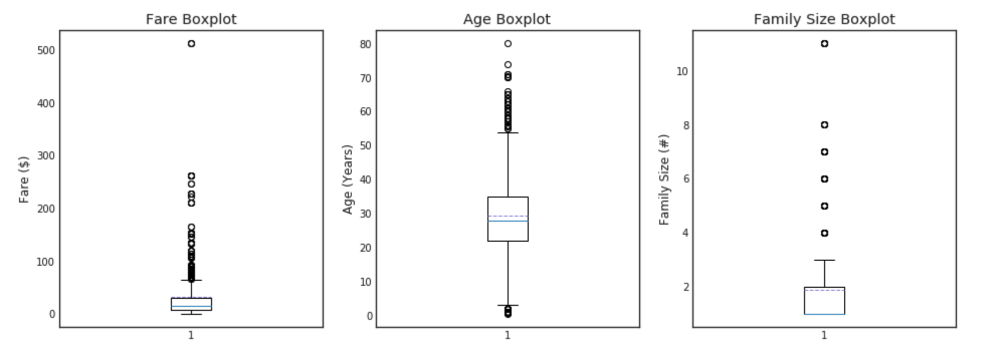
이산 데이터에 대한 plot
이 부분에서 plot을 하는데 있어 연습을 위해 다양한 방법을 통해 구현해본다.
#graph distribution of quantitative data
plt.figure(figsize=[16,12])

plt.subplot(231)
plt.boxplot(x=data1['Fare'], showmeans = True, meanline = True)
plt.title('Fare Boxplot')
plt.ylabel('Fare ($)')

plt.subplot(232)
plt.boxplot(data1['Age'], showmeans = True, meanline = True)
plt.title('Age Boxplot')
plt.ylabel('Age (Years)')

plt.subplot(233)
plt.boxplot(data1['FamilySize'], showmeans = True, meanline = True)
plt.title('Family Size Boxplot')
plt.ylabel('Family Size (#)')

plt.subplot(234)
plt.hist(x = [data1[data1['Survived']==1]['Fare'], data1[data1['Survived']==0]['Fare']],
         stacked=True, color = ['g','r'],label = ['Survived','Dead'])
plt.title('Fare Histogram by Survival')
plt.xlabel('Fare ($)')
plt.ylabel('# of Passengers')
plt.legend()

plt.subplot(235)
plt.hist(x = [data1[data1['Survived']==1]['Age'], data1[data1['Survived']==0]['Age']],
         stacked=True, color = ['g','r'],label = ['Survived','Dead'])
plt.title('Age Histogram by Survival')
plt.xlabel('Age (Years)')
plt.ylabel('# of Passengers')
plt.legend()

plt.subplot(236)
plt.hist(x = [data1[data1['Survived']==1]['FamilySize'], data1[data1['Survived']==0]['FamilySize']],
         stacked=True, color = ['g','r'],label = ['Survived','Dead'])
plt.title('Family Size Histogram by Survival')
plt.xlabel('Family Size (#)')
plt.ylabel('# of Passengers')
plt.legend()

범주형 데이터에 대한 plot
seaborn을 사용한 plot을 해본다.
#graph individual features by survival
fig, saxis = plt.subplots(2, 3,figsize=(16,12))

sns.barplot(x = 'Embarked', y = 'Survived', data=data1, ax = saxis[0,0])
sns.barplot(x = 'Pclass', y = 'Survived', order=[1,2,3], data=data1, ax = saxis[0,1])
sns.barplot(x = 'IsAlone', y = 'Survived', order=[1,0], data=data1, ax = saxis[0,2])

sns.pointplot(x = 'FareBin', y = 'Survived',  data=data1, ax = saxis[1,0])
sns.pointplot(x = 'AgeBin', y = 'Survived',  data=data1, ax = saxis[1,1])
sns.pointplot(x = 'FamilySize', y = 'Survived', data=data1, ax = saxis[1,2])
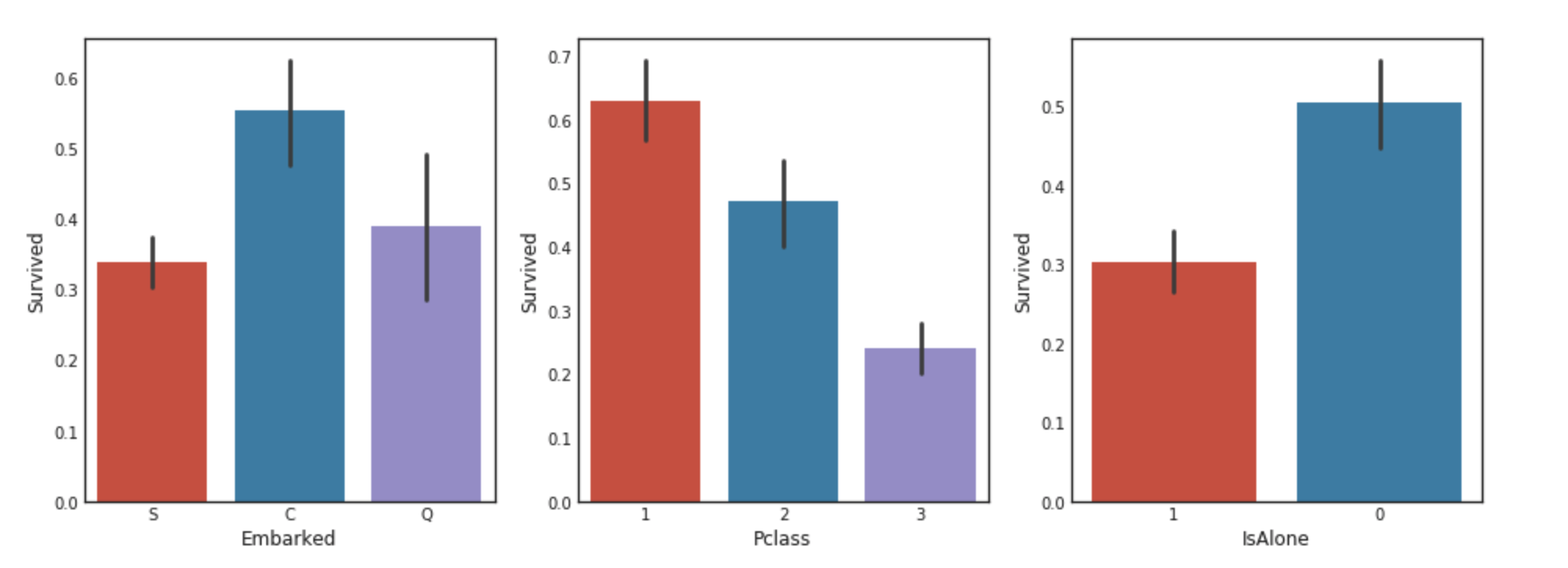
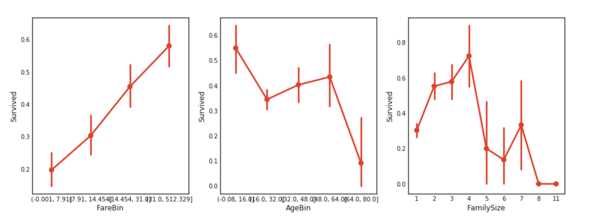
이 단계에서 우리는 Pclass에 따른 생존률의 차이가 있다는 것을 알 수 있다. 조금더 자세하게 비교해보자.
생존 여부, 클래스에 따른 추가 변수의 분포
생존 여부, 클래스에 따른 지불 비용, 가족의 크기, 연령 등의 분포를 알아보자. 분포를 알아볼 때는 보통 boxplot을 사용한다. 하지만, boxplot을 사용했을 때 가독성이 떨어지는 경우가 있다. 그 이유는 점들이 찍혀 있고 그렇기 때문인데, 이럴경우 분포를 보는 것이 목적이라면 violin plot을 쓰는 것이 좋다.
#graph distribution of qualitative data: Pclass
#we know class mattered in survival, now let's compare class and a 2nd feature
fig, (axis1,axis2,axis3) = plt.subplots(1,3,figsize=(14,12))

sns.boxplot(x = 'Pclass', y = 'Fare', hue = 'Survived', data = data1, ax = axis1)
axis1.set_title('Pclass vs Fare Survival Comparison')

sns.violinplot(x = 'Pclass', y = 'Age', hue = 'Survived', data = data1, split = True, ax = axis2)
# sns.boxplot(x = 'Pclass', y = 'Age', hue = 'Survived', data = data1, ax = axis2)
axis2.set_title('Pclass vs Age Survival Comparison')

sns.boxplot(x = 'Pclass', y ='FamilySize', hue = 'Survived', data = data1, ax = axis3)
axis3.set_title('Pclass vs Family Size Survival Comparison')
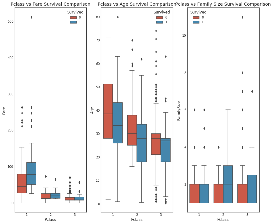
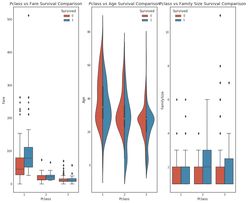
위는 boxplot을 사용했을 때이고, 아래는 violin을 사용했을 때이다. 분포만 보는 경우 아래 경우가 더 수월하다는 것을 알 수 있다. 이 때 option split를 False로 할 경우, 현재 3개의 violin이 나왔지만 이것을 6개로 나누어서 보여준다.
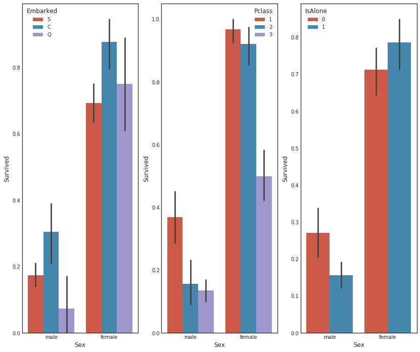
성별과 2nd feature에 따른 생존률
#graph distribution of qualitative data: Sex
#we know sex mattered in survival, now let's compare sex and a 2nd feature
fig, qaxis = plt.subplots(1,3,figsize=(14,12))

sns.barplot(x = 'Sex', y = 'Survived', hue = 'Embarked', data=data1, ax = qaxis[0])
axis1.set_title('Sex vs Embarked Survival Comparison')

sns.barplot(x = 'Sex', y = 'Survived', hue = 'Pclass', data=data1, ax  = qaxis[1])
axis1.set_title('Sex vs Pclass Survival Comparison')

sns.barplot(x = 'Sex', y = 'Survived', hue = 'IsAlone', data=data1, ax  = qaxis[2])
axis1.set_title('Sex vs IsAlone Survival Comparison')
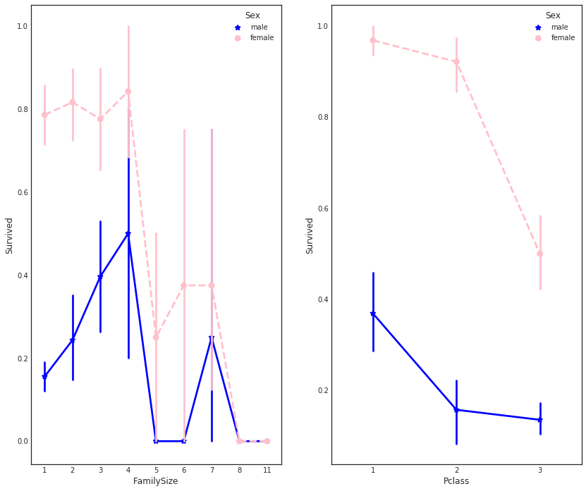
가족 구조와 성별에 따른 생존률 비교
#more side-by-side comparisons
fig, (maxis1, maxis2) = plt.subplots(1, 2,figsize=(14,12))

#how does family size factor with sex & survival compare
sns.pointplot(x="FamilySize", y="Survived", hue="Sex", data=data1,
              palette={"male": "blue", "female": "pink"},
              markers=["*", "o"], linestyles=["-", "--"], ax = maxis1)

#how does class factor with sex & survival compare
sns.pointplot(x="Pclass", y="Survived", hue="Sex", data=data1,
              palette={"male": "blue", "female": "pink"},
              markers=["*", "o"], linestyles=["-", "--"], ax = maxis2)
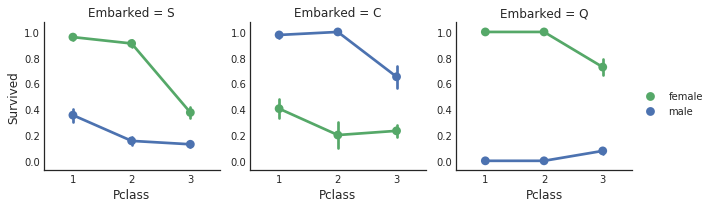
클래스, 출항 항구에 따른 생존률
클래스도 여러개의 factor, 출항 항구도 factor이다. 이렇게 여러개에 대한 plot을 빠르게 하는 방법이 있다. seaborn의 facetgrid를 사용하는 것이다.
e = sns.FacetGrid(data1, col = 'Embarked')
e.map(sns.pointplot, 'Pclass', 'Survived', 'Sex', ci=60.0, palette = 'deep') # 순서대로 x의 구분, y의 구분, 추가 구분
e.add_legend()
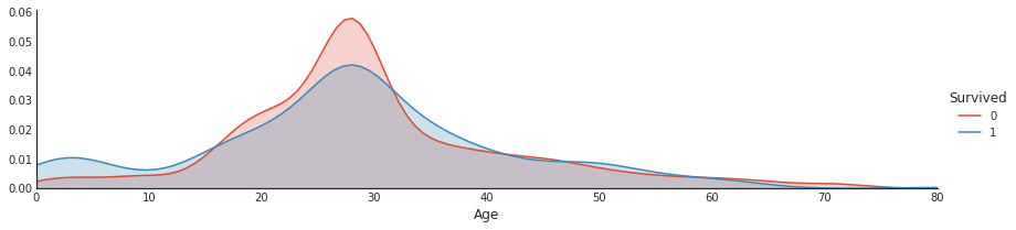
나이에 따른 생존 확률 분포
나이대에 따른 생존률의 분포를 알고 싶다. 이런 분포는 밀도 함수를 구하는 것과 같다. x가 나이, y가 생존확률이기 때문이다. 이럴 때, kernel함수를 사용하여 밀도함수를 만들어 낼 수 있다.
a = sns.FacetGrid( data1, hue = 'Survived', aspect=4 )
a.map(sns.kdeplot, 'Age', shade= True )
a.set(xlim=(0 , data1['Age'].max()))
a.add_legend()
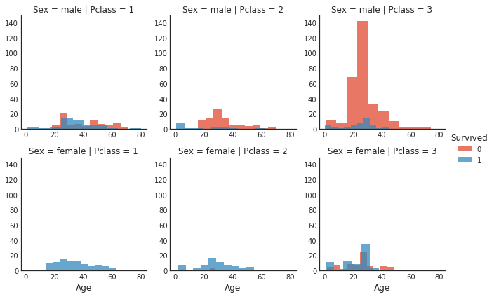
성별, 클래스에 따른 나이에 대한 사람 분포
성별, 클래스에 따른 그래프를 하나씩 생성하기 위해 col, row 구분은 각각 성별, 클래스로 해준다. 그 상태에서 x는 age, y는 히스토그램에서의 개수가 될 것이다. 이 때, 각각의 그래프에서 색상 구분을 통해 survived를 구분해준다.
#histogram comparison of sex, class, and age by survival
h = sns.FacetGrid(data1, row = 'Sex', col = 'Pclass', hue = 'Survived')
h.map(plt.hist, 'Age', alpha = .75)
h.add_legend()
전체 feature들에 대한 plot
#pair plots of entire dataset
pp = sns.pairplot(data1, hue = 'Survived', palette = 'deep', size=1.2, diag_kind = 'kde', diag_kws=dict(shade=True), plot_kws=dict(s=10) )
pp.set(xticklabels=[])
feature를 2개씩 묶어 plot해준다. 이 때, kws은 keyword argument로 dictionary 자료형으로 넣어주면 된다. plot에 있어 설정들을 넘겨줄 수 있다. shade는 밀도함수의 안을 채워서 보여주는 역할을 한다. kde는 kernel density estimation을 의미하며, 커널을 씌워 밀도함수의 모양으로 plot한다.

상관관계 히트맵
각 변수들간의 상관관계에 대해서 plot 해본다. seaborn.diverging_palette
#correlation heatmap of dataset
def correlation_heatmap(df):
    _ , ax = plt.subplots(figsize =(14, 12))
    colormap = sns.diverging_palette(220, 10, as_cmap = True)

    _ = sns.heatmap(
        df.corr(),
        cmap = colormap, # 이친구가 matplot 객체를 입력으로 받는다. as_camp = True로 해줘야 한다.
        square=True,
        cbar_kws={'shrink':.9 },
        ax=ax,
        annot=True, # 박스에 값 입력해준다.
        linewidths=0.1,vmax=1.0, linecolor='white',
        annot_kws={'fontsize':12 }
    )

    plt.title('Pearson Correlation of Features', y=1.05, size=15)

correlation_heatmap(data1)
